Blog
The Ripple Effect: Minnesota Twins launch new City Connect uniforms
Slug, one half of Minnesota hip-hop duo Atmosphere, has expressed concern about the brand-new Minnesota Twins Nike MLB City Connect uniform, which was unveiled this morning.
As the 28th of 30 MLB clubs to join City Connect, the Twins uniform pays homage to Minnesota, its natural landscapes, lakes, wildlife, and even pays homage to a local music legend.
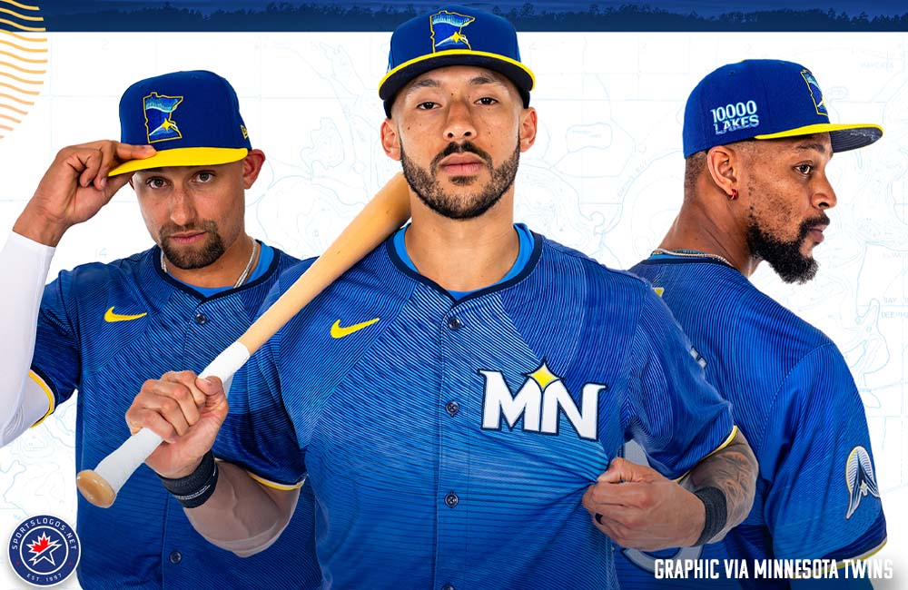
Drawing inspiration from the state motto, “The Land of 10,000 Lakes,” the Twins City Connect uniform (or rather, the “State Connect” uniform) showcases shades of “Deep Blue” throughout. These variations represent a journey into a lake and give rise to a prominent ripple effect on the jersey. Additionally, accents of “Warm Yellow” symbolize sunlight, while a subtle touch of the lightest hue of pink (dubbed “Radiant Pink”) adds to the overall vibe of lakeside relaxation in Minnesota.
According to Heather Hinkel, Twins’ vice president of brand marketing, there’s a certain moment that captures the essence of their new logo. It’s a scene where the water is gently bubbling against rocks, the sun is setting, and the sky is painted with shades of yellow and pink. In her recent discussion with SportsLogos.Net, Hinkel shares that they wanted to create something relatable for their audience. Rather than depicting a specific activity like speedboating or tubing, they chose a universal experience – sitting by the lake at sunset. This is something that we can all nod our heads and relate to, no matter our access or availability to such activities.
City Connect is inspired by the ripple effect of the lakes in Minnesota and the connection between the water and the sky to reflect the state’s natural beauty and cultural significance. The jersey’s colour scheme includes deep blues representing the state’s waters, with lighter and darker blues creating a wave effect and the darkness of a lake as you go deeper.
The first City Connect teams didn’t necessarily tap into sublimation, but now that we’re one of the last teams to go, it’s becoming more common.”
An MN logo appears on the upper left chest of the jersey in white with blue trim. In between the two letters, the North Star graphic appears again in yellow. The letters are curved to represent waves on a lake.
This jersey’s jock tag reads “10,000 Lakes” in the same custom font we see on the wordmark, mimicking the movement of waves. The inside back collar shows the Twins’ alternate State of Minnesota logo recolored in white, blue, and yellow.
It was exciting for the players to have yellow and pink uniforms because they will be creating special cleats and accessories for them.
The City Connect uniform was approached on a state-wide level, rather than focusing on just one city (or two cities if we consider the Twins). “If we were to solely feature Minneapolis for our ‘City’ Connect uniform, it may exclude our Saint Paul audience. Similarly, choosing Saint Paul would alienate the Minneapolis audience. Instead, our focus was on representing the story of our state as a whole, rather than just our team. The uniform does not bear the ‘Twins’ name or logo; its purpose is to showcase the narrative of Minnesota.”
It’s quite uncommon for them to honor a state rather than a city, but the Colorado Rockies patterned their City Connect uniform after the green and white mountain-themed State of Colorado license plate.
They were a bit off the path in terms of the geographic area they focused on, but they did try something outside their comfort zone, which the Twins seized with abandon.
Follow Our Social Media: Facebook, Instagram, Twitter, Youtube
HOMEPAGE: Teenees.net

